ECommerce filtering plays a major role in boosting product discovery for an online store. In fact, 75% of online shoppers admit that they find product filtering to be an essential feature for having a positive shopping experience.
Having an advanced eCommerce product filtering system simplifies browsing on your website and helps customers find what they are looking for.
In this post, we will explain what eCommerce filters are, and their importance, and show you how leading eCommerce brands are using these filters to boost customer experiences.
What Are Ecommerce Filters?
ECommerce filters are specialized tools that are available on online shopping websites to help customers narrow down their search results and refine their product searches. ECommerce filters help customers condense the search results based on different criteria that are built around the unique attributes of your products.
Some of the common eCommerce filters include -
- Price range
- Brand name
- Size
- Color
- Product ratings
- Material
- Product type and so on.
ECommerce product filters enable customers to sort your products based on these criteria or any other specifications they desire. For example, if a customer wishes to buy a dress priced between $20 and $45, then they can utilize the price range filter to display only those dresses that meet that criteria. The remaining products will remain hidden on the website.
By efficiently weeding out unnecessary products, eCommerce filters help you deliver a seamless shopping experience to your customers. It eliminates the need for customers to sort through hundreds of products. It helps them locate desired products without any hassles and add them to their shopping carts to make purchases.
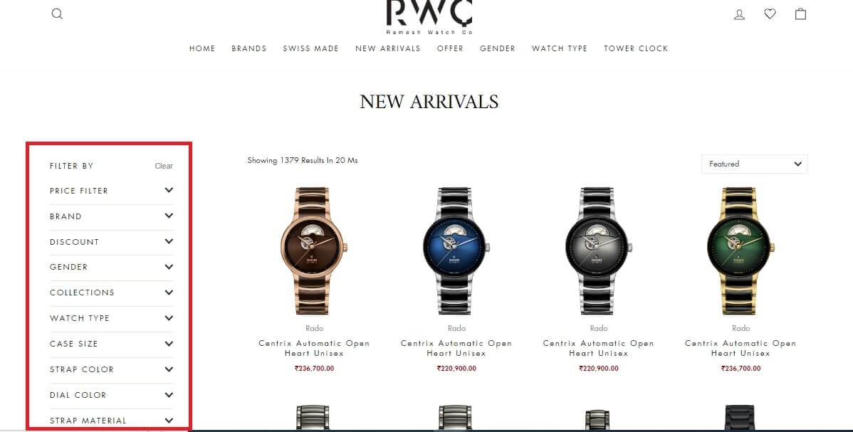
Here is an example of an eCommerce product filter on Ramesh Watch Co., a rapidly growing eCommerce brand that sells all kinds of watches.
Importance of Having Ecommerce Filters on Your Store
ECommerce filters offer a direct way for your customers to browse through your product collections and shortlist desired products based on their preferred parameters. Here are a few reasons why eCommerce filters are indispensable for your online store.
Better Product Discovery
Ecommerce filters offer intuitive shopping experiences to customers by allowing them to easily explore your online store and discover new products that they may not discover through general store browsing. It simplifies the overall product navigation by making the process much simpler and easier. Your customers can select their preferred criteria in the filters widget and have all the products that match their selection automatically presented to them.
Increased Conversions
By using eCommerce filters present on your online store, customers can find the products they are looking for in a matter of a few minutes. This reduces the likelihood of cart abandonment or frustrated shopping experiences. As customers find the products they wish to purchase via tailored search results, they are more likely to make purchases which directly translates to higher conversion rates.
Enhanced Customer Experience
ECommerce filters streamline the product search process making it easier and convenient for customers to find relevant products. It helps them navigate through complex product inventories and locate desired products in no time. This creates seamless shopping experiences for customers that lead to improved customer satisfaction and loyalty.
That being said, let us now explore the different types of eCommerce product filters you can set up on your online store.
What Are the Different Types of Ecommerce Product Filters?
Setting up ideal product filters on your online store requires thorough research and business understanding. These filters must align with your specific product needs and their attributes. Here are some of the most common eCommerce website filters that have proven to be quite effective for most online stores.
Price Filters
Price filters enable customers to set a price range for filtering out the products according to their budget. Depending on how much they are willing to spend, they can narrow down the costs of the products by entering the upper and lower price limits in the filter menu.
Brand Filters
Brand filters are a must for eCommerce websites that sell a large number of products from different brands. It helps customers narrow down search results for products from a particular brand. It is ideal to display the most popular brands at the top of the filters widget for easy access.
Ratings Filters
User ratings filter helps customers sort products based on the average ratings the products have received from other customers who have purchased them. It helps customers identify the products that have received positive feedback from other customers by evaluating the number of stars each of these products have received. It acts as a perfect form of social proof and instills a sense of trust among the new customers to make confident purchasing decisions.
Color
Colors filter helps customers narrow down their product search by providing them an option to choose a desired color for products. It helps your customers view products and their variations by specific colors. Customers can select the desired color(s) from the colors filter widget to have matching products displayed to them. This helps them find products that suit their color preferences and make faster purchase decisions.
Size Filters
Size filter helps customers to refine their product search based on specific size requirements. This filter lists down all the possible sizes of the products and lets customers filter product variations by their size. It helps them quickly find the product they need in exactly the size they want it in.
Promotions Filters
Promotion filters help customers view products that are currently on sale, available at a discounted price, or as part of special promotions. It helps them discover the best deals and discounts available on your eCommerce store. By using these filters, customers can take advantage of these limited-time deals and save money when shopping online. This guarantees you increased conversions and boosts your revenue.
10 Foolproof Ecommerce Filters Design Examples (+ Takeaways)
Let us explore how leading brands from all around the world are leveraging eCommerce filters.
1. Tasva
Tasva, an Indian ethnic wear brand for men, places its product filters in prominent locations to help customers discover them without any hassles. The location of these filters plays a crucial role in customer experience. The brand uses intuitive features related to its products and does not complicate the filtering process by creating extra filters that do not make any sense.
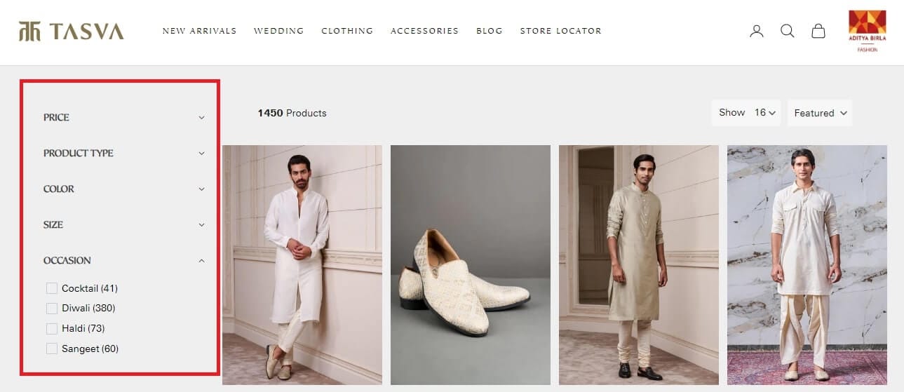
Key Takeaways -
- Keep your product filters simple
- Place the filter panel in easy-to-discover locations - on your website homepage, within a navigation menu, or within a sidebar in the category pages.
2. Pandora
Pandora, a well-known jewelry brand, tailors its filters according to their customer's requirements. The team prepared an exhaustive list of product attributes to identify the right filters for the online store. The aim was to discover what its customers care about and present those attributes in product filters to simplify shopping experiences.
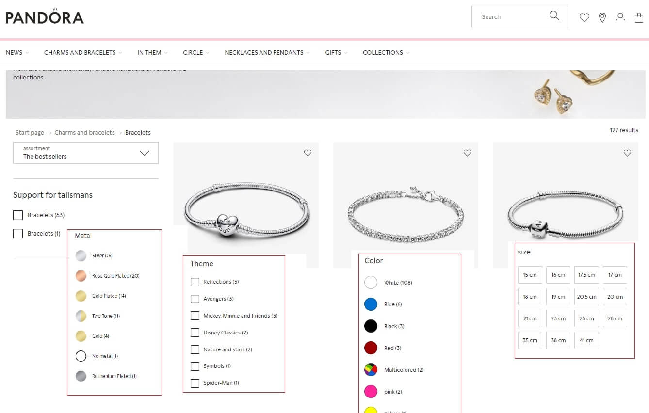
Key Takeaways -
- Design your filters from your customer's viewpoint. These eCommerce filters must help them with their buying process.
- Ask yourself what information your customers will need to make the best purchasing decision and accordingly, add those parameters into your filters panel to simplify product discovery for your customers.
3. Zara
Zara, a famous clothing brand, has placed its filter panel on the top of the page rather than placing it on the traditional left side. The aim is to make the filters visible to customers as soon as they land on the product list page. It promotes utilizing filtering options among customers without them having to scroll the page or navigate extensively to find desired products. This helps Zara to present only those products that match their customers' preferences more effectively.
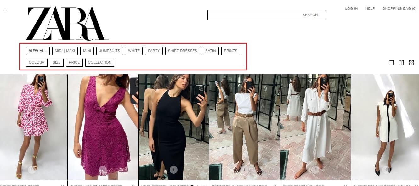
Key Takeaways -
- When placing filters on the top of the page, ensure that the filter layout is compact. Utilize dropdown menus, collapsible panels, and other space-saving techniques to maintain visual clarity.
- Arrange the filter options as per the customer's search behavior to ensure they can select filter options intuitively and see instant results.
4. Individual Socks
Individual Socks highlights the chosen filters in the filters panel to let customers know which filters have been selected. By displaying the set search criteria, customers can maintain the context of search while they browse through the product options. It also allows customers to easily modify or remove these criteria without having to scroll back through the filters panel again.

Key Takeaways -
- Display the chosen filters at the top of the page with an option to cancel them.
- Avoid cluttering this section with too much information or excessive styling.
5. Flipkart
Flipkart, a well-known eCommerce brand, includes product specifications in its filter panel as it helps customers find products that match their specific requirements and preferences. It adds an extra layer of relevance to the search criteria and allows customers to refine the search results to meet their exact requirements.
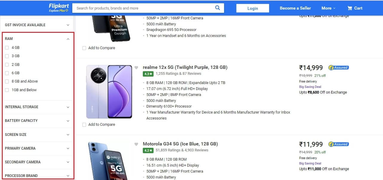
Key Takeaways -
- Include a descriptive label to identify each of the product specifications in the filter panel.
- Start with broader categories and then move to specific ones to make avoid overwhelming the customers.
6. Brava
Brava is Australia's only lingerie chain that specializes in plus sizes. It leverages thematic filters to help customers find desired products, especially when they are in the early stages of their buying journey. Customers can select distinct product specifications like Cup Size, Back Size, and more to narrow down their product searches. Thus, helping them find products that match their preferences more accurately and simplify the purchasing process.
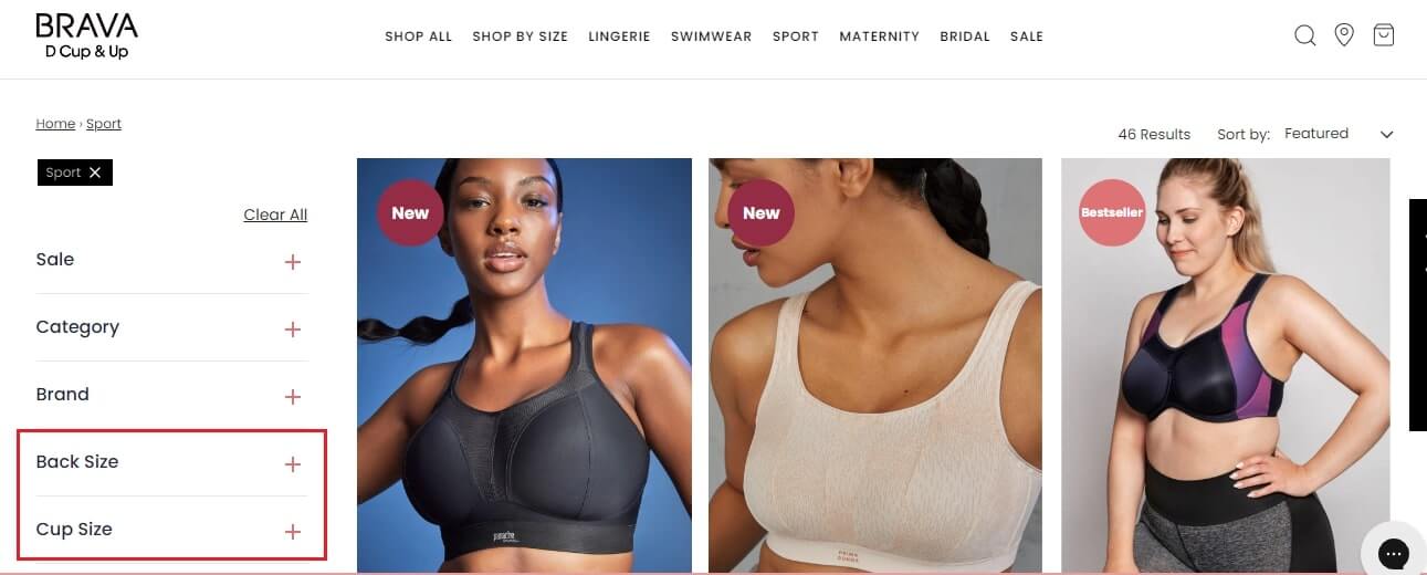
Key Takeaways -
- Match the product attributes within a specific category to discover filter criteria within that category.
- Maintain consistency in these filters across different category pages to help customers navigate more efficiently.
7. Ramesh Watch Co.
Ramesh Watch Co., a luxury watch dealer, allows its customers to choose multiple filter criteria in every category to streamline search experiences. This filtering flexibility comes in handy when customers do not know what exactly they want to buy. This offers customers a variety of options to choose from. It also helps them compare these products with one another and make informed buying decisions.
Key Takeaways -
- Allow customers to tailor their search results to match their unique needs.
- Monitor your store performance upon installing the filters especially page load times, filter processing engine, and so on.
8. Amazon
Amazon, an eCommerce giant, presents promotion filters in its filter panel to encourage customers to check out its limited-time deals and boost conversions. It helps customers navigate through the items that are on discount in just a few clicks.
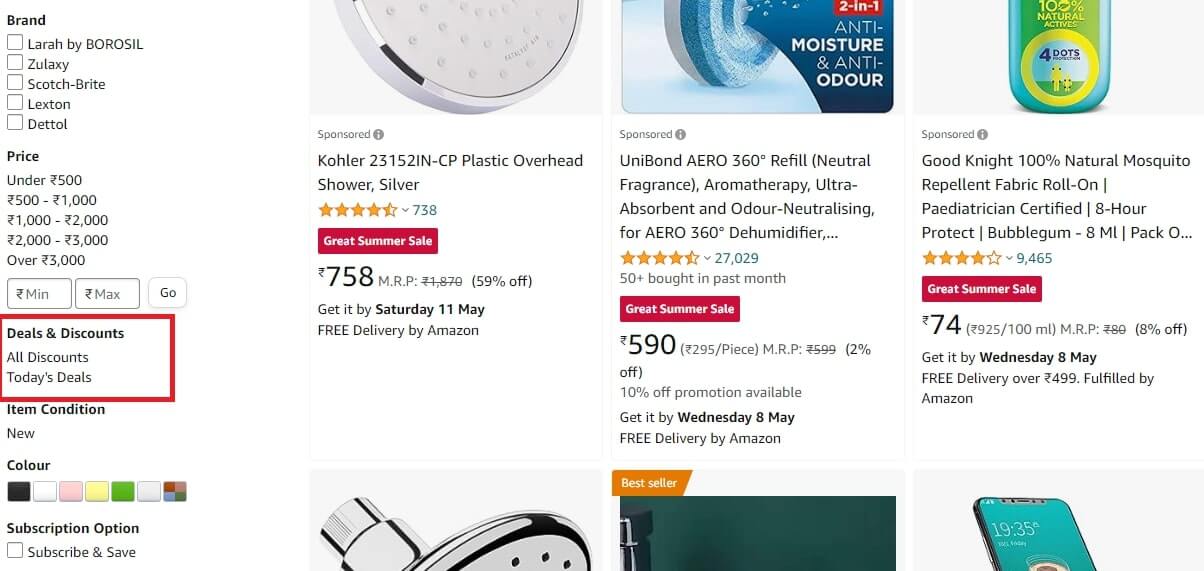
Key Takeaways -
- Use promotion filters to highlight specific products like new arrivals, discounted items, bestsellers, or special promotions.
- Merchandise your products strategically to promote slow-moving items, cross-selling related products, and more.
9. The Unreality Store
The Unreality Store is an online store selling comics, graphic novels, books, and magazines to comics enthusiasts all around the world. It offers an intuitive filter panel with perfectly placed filters that are relevant to search queries. By ordering filters according to their importance in search behavior and not alphabetically, The Unreality Store delivers a smooth product search experience to customers.
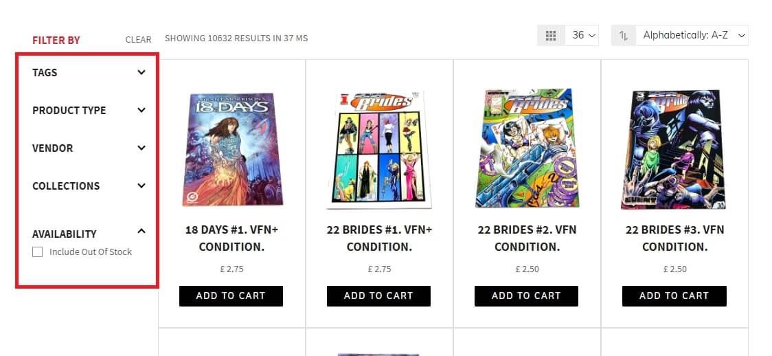
Key Takeaways -
- Define the relevant factors that directly relate to your products. This could include product ratings, reviews, popularity, and more. Implement the filtering engine on these criteria to make it easy for customers to access and select desired products.
- Never place various filter criteria using an alphabetical approach. Instead, understand the intent of your customers and revamp the position of these filters accordingly.
10. Macy's
Macy's, an online clothing and accessories shopping website, utilizes brand filters to help customers find products from desired brands quickly. When a customer chooses a brand from this filter, Macy's filtering engine hides products from other brands so that the customers can view only those products that they are likely to purchase. This encourages more sales on their eCommerce store.
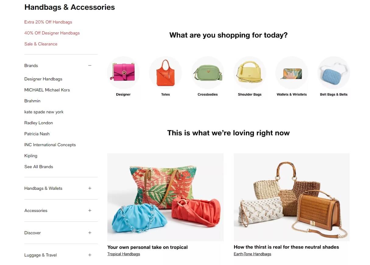
Key Takeaways -
- Make a list of brands available on your eCommerce store and update this list regularly so that you can update your filters accordingly.
- Highlight popular brands and make them more accessible to customers. If possible, include brand logos along with the brand names in the filter options to make it easy for customers to identify them.
Ecommerce Product Filters - Best Practices to Follow
Here are some more eCommerce filter best practices you can implement in your online store to improve eCommerce filters UX.
- Label your filters clearly. Use short content that describes them well. This will ensure your customers will quickly understand each filter option.
- Make sure that the filters panel is shown to customers no matter how long they scroll the page.
- Include visual cues like checkboxes to let customers know which filters they have chosen.
- Allow customers to reset all the chosen filters without any hassles.
- Optimize your filters for mobile devices. This will ensure that customers will be able to access filters through their mobile devices.
- Try out various filter designs and layouts with A/B testing to discover what works best for your particular audience.
Optimize Your Ecommerce Filters Using Sparq
ECommerce filters play an important role in enhancing the user experience and driving conversions on online shopping platforms. By implementing effective filtering options such as price filters, brand filters, rating filters, and more, you can empower your customers to find products that match their preferences with ease.
Sparq offers an advanced filtering tool that can transform your online store and take it to the next level. With the help of customizable filters, you can enable your customers to navigate through your vast product catalogs with precision. Sparq is designed to optimize product discovery, improve customer engagement, and boost sales.
Contact our team today to learn how our eCommerce filter tool can help you design exceptional shopping experiences for your customers.