Shoppers who use site search convert at several times the rate of shoppers who browse, and only a small fraction of your visitors ever use it. That combination is what makes the search bar the highest-leverage 40 pixels on an ecommerce store, and the reason a design decision as small as placeholder text shows up in revenue.
This guide covers the twelve rules that actually move search conversion, twenty search bar UI examples from real stores, the mistakes that cost sales, and the metrics that tell you whether your own search bar is working. If you run a Shopify or WooCommerce store and you have never audited your search bar, start with the zero-result rate section — it is usually where the money is hiding.
What a search bar UI is actually made of
A search bar is the input field customers use to find products without navigating your menu. Around 43% of retail visitors go straight to it, and stores with well-designed search see meaningfully higher conversion rates than those without.
The interface itself has five components, and every rule in this guide is a decision about one of them.
Search icon — the magnifying glass that signals the function. Usually at the start of the input field.
Text input field — where the query is typed. Wide enough to show a full query without truncating it.
Placeholder text — the hint inside the box. "Search for products", "What are you looking for?", or something specific to your catalogue.
Clear button — lets customers reset the query in one click. Appears once the field has content.
Submit button — initiates the search. Usually at the end of the field.

The 12 rules
1. Never hide search behind an icon on desktop
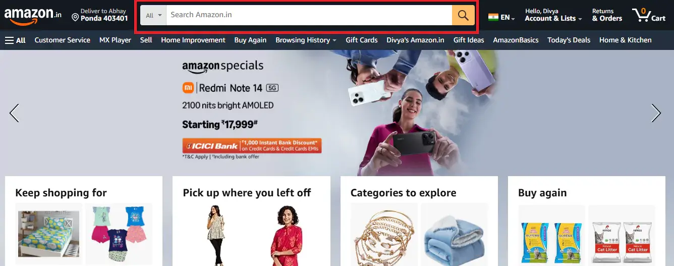
If you have more than 100 products, show the full input field. A magnifying glass icon adds one unnecessary click before a high-intent shopper can even start, and that click costs you. Amazon's search bar is not revolutionary in design — it is revolutionary in commitment. It is always visible, on every page, at the same width.
2. Put it top-centre or top-right, and keep it there
Place the bar where customers are already trained to look, and keep the position identical on every page. Consistency matters more than the specific choice between top-centre and top-right. Amazon puts it top-centre and never moves it; that predictability is the point.
3. Make it wide enough to show the whole query
If a shopper types "waterproof hiking boots womens size 8" and can only see the last four words, they cannot verify what they typed. Truncation causes re-typing, and re-typing causes abandonment.
4. Use placeholder text that guides rather than decorates
"Search…" tells the shopper nothing. Conversational microcopy — the kind Allbirds and Brava use — signals that the search actually works and hints at what is searchable.
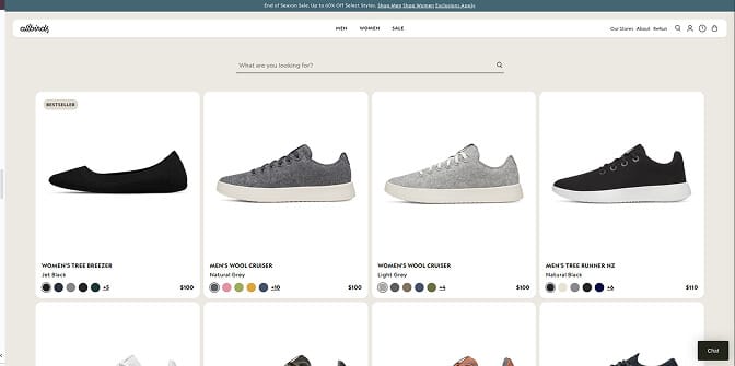
If your catalogue is searchable by brand or size, say so: "Search by brand, size or style" outperforms a generic prompt because it tells shoppers what vocabulary the box understands. One caveat — placeholder text must clear the moment typing starts. Placeholder text that lingers is a usability bug, not a feature.
5. Put products in the dropdown, not just words
This is the single highest-value change most stores can make. Text-only autocomplete is a missed conversion lever; visual suggestions with product images, names and prices convert substantially better.
Princess Polly suggests products, not search terms. Type "blue dress" and you immediately get four product matches with images and prices, trending searches, and collection shortcuts.
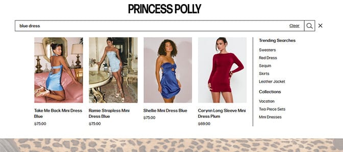
That does three things at once: it cuts time-to-product by letting shoppers skip the results page entirely, it builds confidence before they commit, and it resolves ambiguity by showing what "blue dress" actually means in your catalogue.
6. Start faceting inside the dropdown
Most stores treat search and filtering as separate steps. Sephora merges them: type "red lipstick" and the dropdown returns category matches, brand matches, and top products with ratings, all before the results page loads.
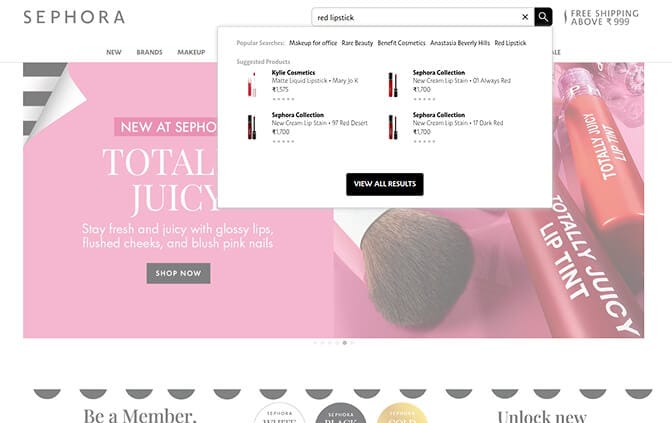
For catalogues with complex attributes — beauty, fashion, home goods — this pattern cuts search abandonment sharply because shoppers self-select their path without extra clicks.
7. Make typo tolerance invisible
Typos happen, especially on mobile. Urban Outfitters handles misspellings so gracefully that shoppers do not notice the correction: type "jeens" and you get jeans, with no condescending "Did you mean…?" interstitial.
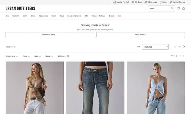
Typo tolerance alone typically recovers 10–15% of searches that would otherwise fail. Pair it with a synonym list so "sofa" returns products tagged "couch" and "sneakers" returns "athletic shoes".
8. Design mobile search separately, not as a shrunken desktop
Over 60% of ecommerce traffic is mobile, yet most search UIs are designed for desktop and crammed onto smaller screens. Bombas inverts this with a full-screen search overlay, large tappable product cards, and a sticky filter bar that lets shoppers refine without scrolling back up.
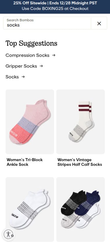
The test is simple: open your store on an actual phone and try to buy something using only search. If it needs pinching, zooming or precision tapping, you are losing conversions.
9. Treat the zero-result page as merchandising, not an error
A dead-end "No results found" page is a conversion killer, and it is the most neglected page in ecommerce. REI's version includes spelling suggestions, related categories, and popular products that might match the intent.
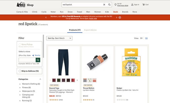
Every zero-result page should offer a path forward. Never leave a shopper who told you exactly what they wanted staring at an empty page.
10. Surface content, not only products
If you have guides, lookbooks or tutorials, your search should return them. Gymshark's search for "leg day" returns leggings, shorts and workout guides, because shoppers are often looking for a solution rather than a SKU.
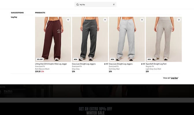
Birchbox does the same with articles, FAQs and brand pages. This is federated search, and it stops your best marketing assets from being hidden behind a product-only filter.
11. Show trending and popular searches to undecided shoppers
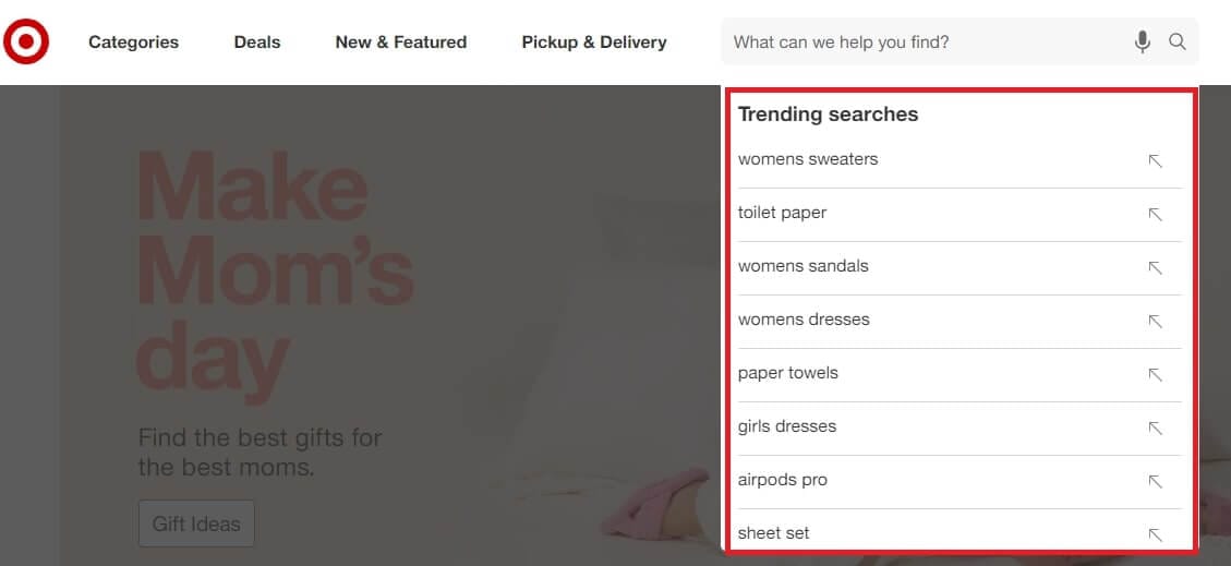
Target puts trending searches in the dropdown before anyone types. For shoppers who do not know what they want, it doubles as social proof about what is selling.
12. Give the bar a visible active state
Small interaction cues make the bar feel responsive. Nike changes the icon colour on hover. Spotify animates the border to white on focus. Speedo and Samsung dim the rest of the page with an overlay so nothing competes with the query.
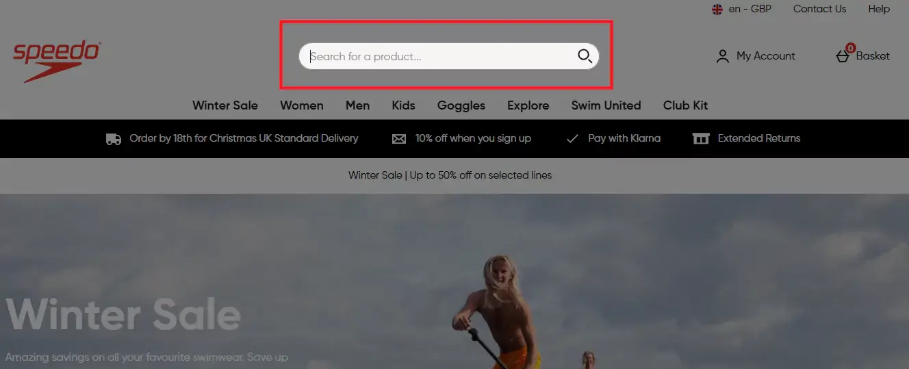
None of these change functionality. All of them make the bar feel like it is working, which is most of what "polished search" means to a shopper.
Which type of search bar does your store need?
The twelve rules above assume your search can actually execute them. Many cannot. Search bars fall into five types, and the gap between the first and the last is categorical rather than incremental.
Type 1 — Basic keyword match. Matches exact words in titles and descriptions. Fine under 50 products. Breaks the moment a shopper searches "sneakers" and your products say "athletic shoes".
Type 2 — Autocomplete. Suggests results as the customer types. Best for 100–500 products. Still usually keyword matching underneath — faster and friendlier, but not smarter.

Type 3 — Faceted search with filters. Search returns results, then offers filter options generated from what is actually in that result set. Best for 500+ products across multiple categories. The key property: if you have no red leather jackets, red does not appear in the colour filter. That is what prevents dead ends.
Type 4 — Typo-tolerant search with synonyms. Handles misspellings and vocabulary mismatches. Worth it for any store serious about conversion, and it tells you what customers call your products versus what you call them.
Type 5 — AI-powered natural language search. Understands intent rather than words. "Something warm for winter hiking" returns insulated jackets even when those words appear nowhere in your catalogue. Best for 1,000+ SKUs or complex attributes.

How to choose: under 100 products, autocomplete is enough. At 100–500, add typo tolerance. At 500–2,000, faceted search with synonyms is essential. Above 2,000, natural language understanding stops being a luxury.
Product count is not the only trigger. If your products have complex variations, if your customers use varied vocabulary, or if your average order value makes each recovered search valuable, you need smarter search earlier.
20 search bar UI examples worth studying
1. Amazon — always visible, full width, category scoping built in, with a dark overlay on focus. Treats search as primary navigation rather than a backup.
2. Allbirds — conversational microcopy that reads like a store associate offering help.
3. Princess Polly — visual autocomplete with products, prices, trending searches and collection shortcuts.
4. Sephora — faceted search that begins in the dropdown, splitting results into categories, brands and products.
5. REI — a zero-result page that still merchandises, with spelling suggestions and related categories.
6. Urban Outfitters — invisible typo correction with no interstitial.
7. Gymshark — search as discovery, returning content alongside products.
8. Bombas — mobile-first full-screen overlay with large tappable cards and a sticky filter bar.
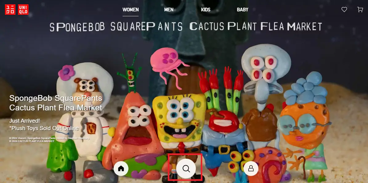
9. Uniqlo — search icon placed at the bottom of the viewport for an app-like feel, with smart autocomplete.
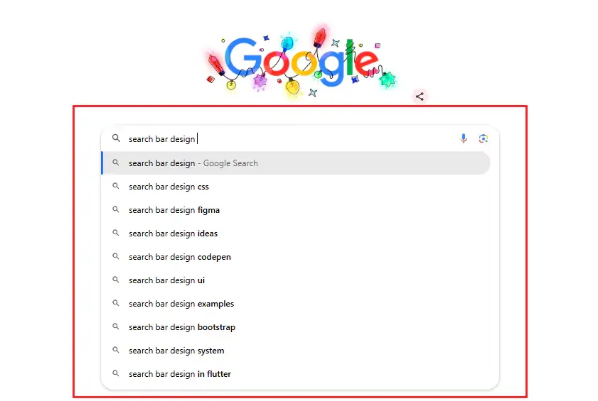
10. Google — real-time suggestions with bolded differentiators so users can scan options quickly.
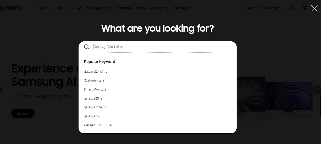
11. Samsung — a full-page search overlay that removes all competing content and surfaces product suggestions live.
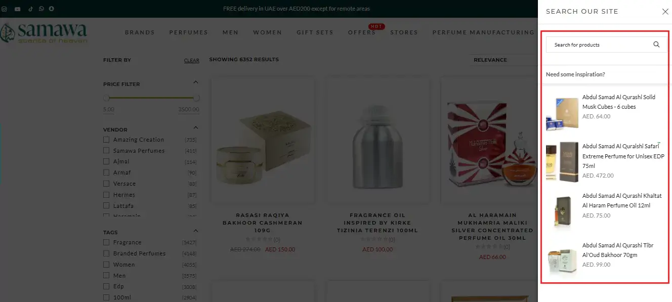
12. Samawa Perfumes — a side-panel search that slides in over a hidden page, creating a distraction-free query experience.
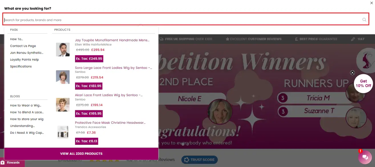
13. Valentine Wigs — a slide-down bar that also surfaces popular products and trending posts before any query is typed.
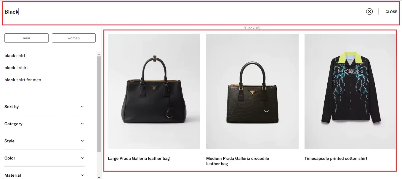
14. Prada — a search icon that expands to full page, with product recommendations that refresh instantly as the query changes, including categories and colour variants rather than only exact matches.
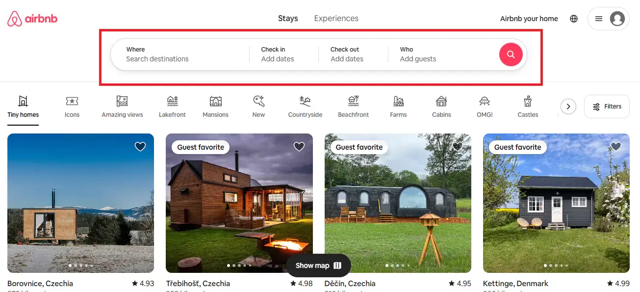
15. Airbnb — query plus structured filters in the bar itself, then deeper refinement immediately beneath it.
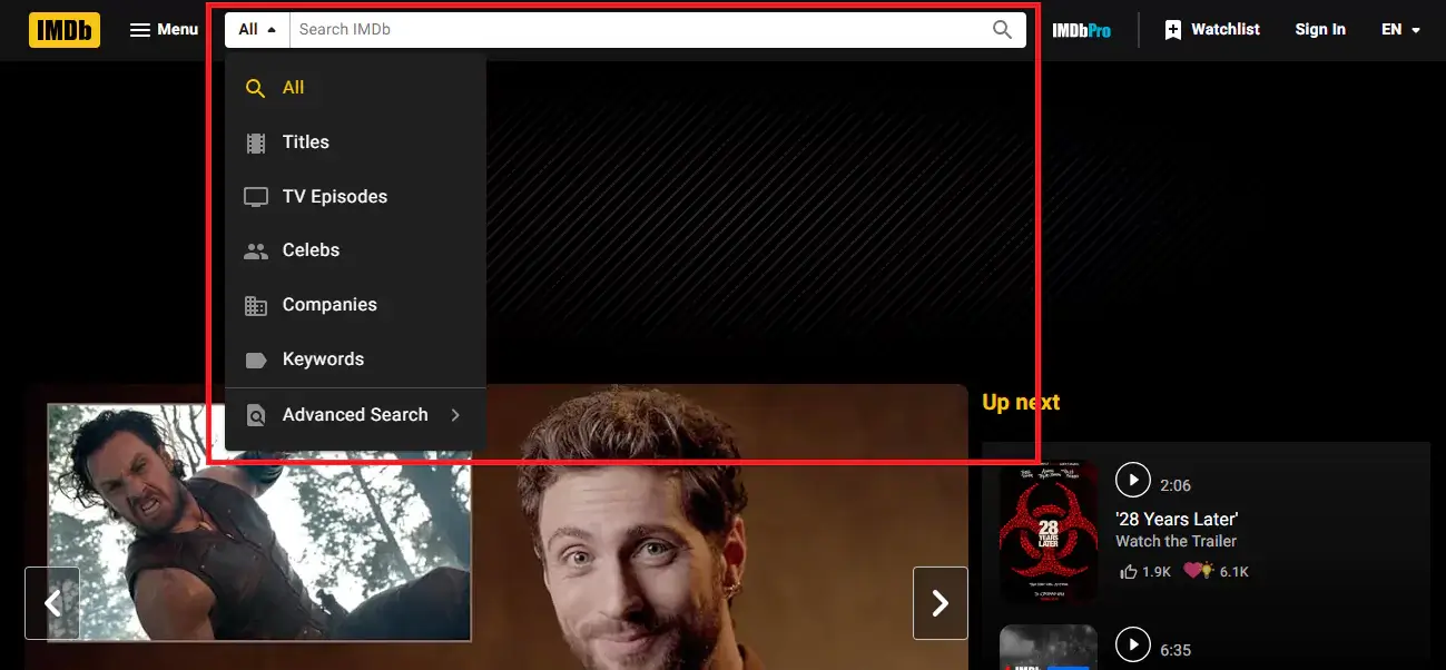
16. IMDb — a category selector inside the bar so users can scope before they type, plus an advanced filter page for multi-criteria queries.
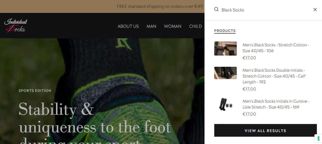
17. Individual Socks — a compact icon that opens a slide-out panel with a universal filter, keeping a minimal header while still offering full search.
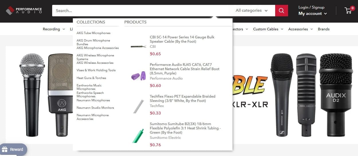
18. Performance Audio — faceted filtering applied directly to search results, so shoppers refine rather than restart.
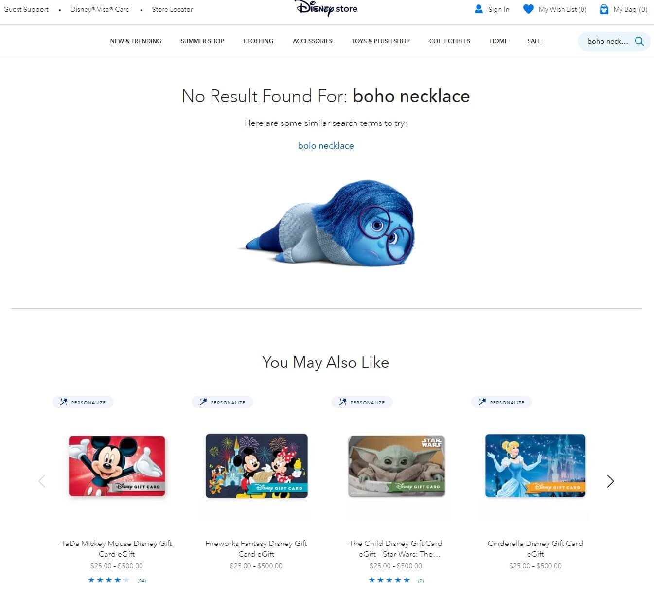
19. Disney Store — a considered no-results page that names the failed query and offers alternative products.
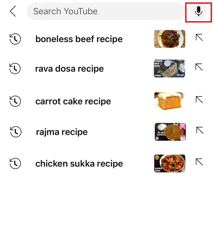
20. YouTube — voice search beside the input field, which matters for mobile and TV interfaces where typing is slow.
Honourable mentions for interaction detail: Trello's compact-to-expanded transition, Facebook's tap-to-expand mobile icon, Nike's hover state, and Spotify's border microanimation.
The most expensive search bar mistakes
Before redesigning anything, audit for these:
- Search hidden behind an icon on desktop when the catalogue is large enough to need it.
- Text-only autocomplete — suggestions without product images leave the biggest conversion lever untouched.
- No fallback on failed searches — every zero-result page needs a route forward.
- Mobile treated as an afterthought — desktop patterns do not translate to thumbs.
- Placeholder text that does not clear when the customer starts typing.
- A submit button too small to hit reliably, forcing precise mouse or thumb targeting.
- No auto-correction, which makes customers retype queries to fix their own typos.
What to measure
A search bar redesign is only worth doing if you can tell whether it worked. Four numbers:
Zero-result rate — the share of searches returning nothing. Under 5% is the benchmark. Stores on basic keyword search commonly sit at 15–25%.
Search exit rate — the share of searchers who leave immediately after searching. Above 30% is a warning, above 50% is an emergency.
Search-to-purchase conversion — searchers should convert several times better than browsers because they arrived with intent. If they do not, your search is failing them.
Revenue per search session — track the trend rather than the absolute number. It should rise as search quality improves.
For a fuller treatment of which numbers to track and where to find them, see our guide to ecommerce search ROI and KPIs.
Improving your search bar this week
You do not need a full redesign to make progress.
First, pull your search analytics and look at the top 20 queries. Do they return relevant results? Any returning zero? Fix those first — it is the lowest-hanging revenue on the list.
Second, test search on a real phone. Run five common queries and time how long it takes to reach a product page. More than ten seconds means you have a UX problem.
Third, add visual autocomplete. If your current app cannot show product thumbnails in suggestions, that alone is a reason to switch.
How Sparq handles search bar UI
Building a search bar from scratch means more than styling an input field. It means autocomplete infrastructure, synonym management, typo tolerance, faceting, analytics, and ongoing maintenance as the catalogue grows.
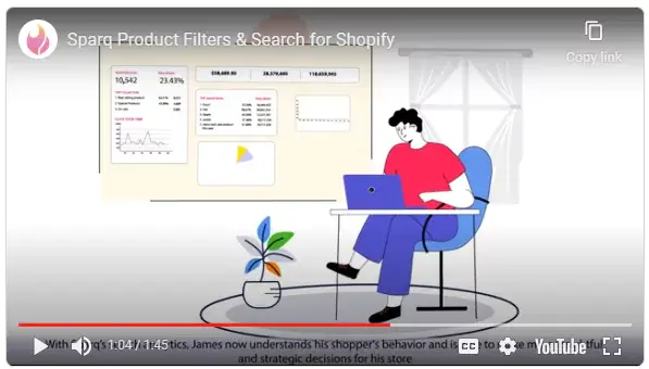
Sparq gives merchants that stack out of the box:
- Instant results delivered as customers type, with product images, prices and ratings in the dropdown
- AI semantic search that reads intent rather than matching keywords
- Query autocomplete surfacing popular and trending terms
- Advanced filters and faceted navigation applied to search results
- Customisable UI — placeholder microcopy, custom HTML, theme-matched styling, banner rules, and dropdown configuration down to the rating display
- Search analytics showing exactly what customers searched for and what returned nothing
It runs on Shopify and on WooCommerce, with BigCommerce and Magento supported as well. Setup takes minutes rather than a development cycle.
Book a demo or check pricing to see how it fits your store.
Frequently Asked Questions
Where should the search bar go on an ecommerce site?
Top-centre or top-right of the header, visible on every page, in the same position throughout. The specific side matters less than consistency and visibility. If you have more than 100 products, show the full input field rather than hiding it behind an icon.
What placeholder text works best in a search bar?
Text that tells shoppers what the box understands. "Search by brand, size or style" outperforms "Search…" because it teaches vocabulary. Keep it short, make it conversational, and make sure it clears the instant typing begins.
How many results should the search dropdown show?
Four to eight product suggestions with images, plus a small number of category or collection shortcuts and a link to the full results page. Enough to be useful, few enough to scan without scrolling — especially on mobile.
Should the search dropdown show product images?
Yes. Visual autocomplete consistently outperforms text-only suggestions because shoppers can click straight into a product and skip the results page. This is usually the single highest-return change available to a store with text-only suggestions.
What is a good zero-result rate for ecommerce search?
Under 5%. Stores running basic keyword search often sit at 15–25%, mostly from typos, synonym gaps and natural-language queries. Typo tolerance and a synonym list typically recover a large share of those searches.
Can I build my own search bar?
You can, using your theme's native search or an open-source framework. The interface is the easy part — relevance ranking, typo tolerance, synonym handling, faceting and analytics are where the engineering cost lives, and they need ongoing maintenance as the catalogue grows.
Will a search app slow down my store?
A well-built one will not. Quality search apps load asynchronously and cache results, typically returning results faster than native platform search. Look for a solution built for your platform to ensure theme compatibility.
What is the difference between faceted search and filtered search?
Faceted search generates filter options from the current result set, so only attributes that exist in those results appear. Traditional filtering shows every possible filter regardless of availability, which lets shoppers select combinations that return nothing.