You probably invest a lot of money and time in implementing loads of marketing and promotional campaigns, driving traffic to your eCommerce store, and convincing visitors to make purchases. However, there’s one problem; your Shopify product landing page, where it matters, might be a leak in your conversion funnel. The effect of that would be very devastating.
The product landing page remains an integral part of your eCommerce store and one you should never take for granted. Unlike other web pages that may be boycotted, it is one area of your eCommerce website, and conversion or sales funnel that always makes an appearance.
Whether you currently have problems designing it or as an old eCommerce business you've designed yours long ago, guidance is still needed. This article provides you with information on the main structure of a landing page. It answers questions as regards where a lot of eCommerce stores get it wrong, and the right elements and best practices to ensure that your Shopify product landing page is as perfect as it needs to be. Let’s get right in.
Main Features Of A Shopify Product Landing Page

A product landing page only has one goal to achieve; ensure leads are converted into sales. Different products have their different landing pages, however, a few features remain common no matter what product it is.
- The “Above The Fold” Portion: This refers to the first part of your Shopify product landing page your visitors see before scrolling and serves as an area you want to take advantage of. For a lot of eCommerce stores, this area typically contains a “hero image”, which could be a still image, animation, typography, or a mix of all these to capture the attention of visitors. Alternatively, depending on what your landing page is used for, this area may be totally boycotted.
- Content: Content refers to both text and visual elements on the product landing page persuading your visitors to take action. It typically includes images of products, features or descriptions of the product, pricing, persuasive wordings, and any other information you want your leads to know.
- Conversion Elements: Your conversion elements are the mediums through which your leads proceed to make purchases. For a product landing page or any type of landing page, the most important conversion element remains the call to action (CTA) placed on it. It is a typically hyperlinked text that calls your lead to finally take a step, such as “buy now”, “try now”, “purchase”, or whatever you wish to use. CTAs prove to be very important in optimizing your product landing page and we shall get to that in a bit.
- Footer: Probably the most unimportant part of your Shopify product landing page, the footer is the area below everything else. It typically contains forms and social media links with intentions to retain interest in your business. The footer is also usually kept as minimal as possible.
Now, the effectiveness of your Shopify product landing page depends on how these elements are arranged and what they are made of. This is where a lot of eCommerce store owners and designers get it wrong. What are the most common mistakes?
Common Mistakes In Designing Shopify product landing pages
Low-Quality Images

High-quality images remain desirable regardless of context. Pixelated or low quality images serve as turnoffs for a lot of website visitors and your product landing page is not exempted. However, even website owners know this but still choose to use them nonetheless.
Why?
Without proper optimizations, high-quality images slow down websites. Rather than spend time optimizing through Content Delivery Networks (CDNs) and caching, or tools that reduce image size without sacrificing quality, website owners simply decrease the quality of images themselves without knowing the repercussions of this.
Cold Language And Tone
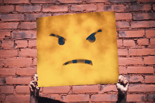
The use of words within product landing pages also plays a role, with a lot of websites being too plain or cold, sacrificing a lot of persuasive effect.
Bad Call To Action
As said before, CTAs are typically hyperlinked texts directing leads to where they finally make payments. A lot of product landing pages have this CTA broken, being ineffective for what they are used for. Whether they don’t work at all, perform wrong actions, or direct towards wrong addresses, faulty CTAs mean almost zero conversions for your eCommerce store.
These, among a number of other mistakes, affect conversions through product landing pages. Fortunately, there are design strategies or practices that are approved to work for your Shopify product landing page.
Shopify product landing page Best Design Practices
Minimalism Is Key
Modern regular website design is commonly characterized by increased simplicity in design elements and colors. For product landing pages, this has been the case from time immemorial. Your Shopify product landing page has only one goal and typically leads to one thing; the CTA. You don’t want a design that makes it difficult to find it. Your design is expected to be as simple as required, having a lot of white space as well as a flat and symmetric design.
Build Trust
Creating trust in the minds of your eCommerce store visitors enormously helps with your conversions. First of all and importantly, social proof helps and it involves the use of user-generated content within the content of your Shopify product landing page. You include beneficial reviews from customers from your social media pages or directly within a reviews section integrated into the page. Trust is also built using a guarantee, like a money-back guarantee, assuring your customers that they stand nothing to lose from making use of the product.
Optimize Your CTA
The CTA is probably the most important part of your product landing page and you want to make sure it performs perfectly. CTAs compile design structure, colors, and use of words, so you want to make sure that all these fit properly into the Shopify landing page design as well as the product’s context. You also want your CTA to be as concise and specific as possible, and place it at the perfect place, which is a part of the landing page easily accessible when leads decide to take a further step.
Make It Easy To Skim
Through bold texts and headlines highlighting the most important content on the product landing page, you want it to be very easy to scheme for the users that don’t take their time. You want to make use of a single large header and multiple subheadings within the product page. You also keep other content easy to read through short paragraphs and readable fonts.
A/B Testing
Performing A/B testing on your product landing page proves to be one of the most effective techniques, especially when you have changes to make and are not settled with one design. A/B testing may be executed on just one element, a few elements, or the whole interface and design elements on your product landing page. The main goal remains to track each of these different versions of your Shopify landing page and get the one that works best for you. This remains a continuous process.
Some other best practices include the use of contrasting colors so the text stands out, engaging graphic elements, forms that take your user experience design into account, and bullet points for product descriptions and listing benefits.
Hope you found these suggestions insightful. It’s advisable to invest in your shopify landing page design by hiring a professional since these aspects are mostly one-time or once a year investment.
